Have you ever looked at logos and wondered what they truly mean or what inspired the designer? Sometimes a company or brand logo carries more than what appears at first sight. Here are 15 logos that you see almost on a daily basis and we at Menzene take a look at the hidden meanings or messages embedded in them. We can assure you that you won’t look at these logos the same way again!
1. Baskin Robbins

The BR in the Baskin Robbins logo is made of two colors. When you focus on just the pink portion, the number 31 appears which denotes the number of flavors Baskin Robbins offers!
2.Picasa


You probably are aware of Toyota’s famous 3 ellipses logo, but do you really know what it means? They signify three hearts: the heart of the customer, the heart of the product and the heart of progress in the field of technology.
5. FedEx

At first this may appear as something simple and straightforward. However, if you look at the white space between the “E” and “x” you can see a right-facing arrow. This “hidden” arrow was intended to be a subliminal symbol for speed and precision.
6. Carrefour

Carrefour apparently means “crossroads” in french and the logo shows two opposite arrows inside a diamond shaping the “C” letter with the negative space between them. This can be a bit hard to spot!
7. Vaio

At first you just see the word VAIO, but look a little closer and you’ll see the first two letters represent an analog symbol and the last two letters represent binary symbols. Pure genius!
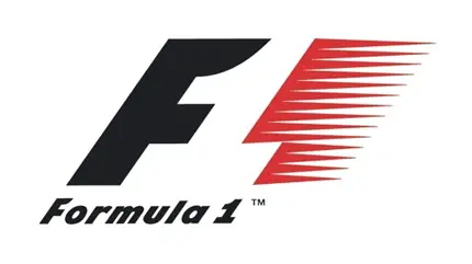
8. Formula 1

Between the letter F and the speed marks is the number one.
9. Hope For African Children Initiative

When you first look at it, it looks like any other map of Africa. But take a closer look and you’ll see an adult and a child facing each other.
10.Toblerone

This chocolate company has its headquarters in Bern, Switzerland which is commonly referred to as ‘ the city of bears’. Thus rightfully so, the company included a bear in its logo that appears to climb a mountain.
11. Unilever
Unilever produces so many different products that sometimes it’s hard to keep track of everything they do. Lucky for us, the symbols for most of the things they make are included in their logo.
12. Amazon
See where that arrow points? It suggests that you can buy everything from A to Z on Amazon.
13. Sun Microsystems
Usually tech companies stick with boring, meaningless logos, but not Sun Microsystems. Take a closer look at that diamond and you’ll see that it actually reads ‘Sun’ in every direction.
14. NBC

Ever notice the peacock in the middle of the logo. The numerous colors on its covert feathers were purposefully included during the 50′s. At that time NBC’s owner was RCA and they had just begun to manufacture color televisions. RCA wanted people who were watching black-and-white televisions to know what they were missing, so they created a colorful logo.
Via:Menzene


No comments:
Post a Comment